Only a small post with the link to my final Processing piece which is running on my site.
www.jmmoore.co.uk/processing.html
I hope you enjoy it. J!
Sunday, April 18, 2010

Sketch signing
Applets by comparison are considered untrusted since they are initiated automatically in the browser. This restriction prevents applets from doing certain things, such as loading content from a different domain than the one hosting the applet.
Due to the fact that I am using data from another domain, and that this piece will have to run from my website, I will obviously have to sign the applet. To do this I had to use 'Terminal' on the mac, in the utilities folder which I rarely visit. I had never used this program before so after doing some research online I found these two helpful resources, which with a bit of common sense made this process easy to achieve.
First off was a YouTube video on the general workings of Terminal, then secondly this forum post on the actual process of signing the sketch.
I have also included this picture of my signing just to show where the changes are that I made to make it relevant to my piece.

Processing - Back to the drawing board (almost)
After spending a substantial amount of time trying to deconstruct and understand the 'Flies' sketch, I have come to the decision that I am no longer going to base my sketch around the swarm mechanic. This was due to two main reasons, firstly I feel I haven't spent enough time with 'Processing' to be able to understand how this works, even though I could bend the existing sketch to fit my purpose, and secondly, linked to this point is the fact that to make my sketch work in the way I intended it to I would have to 'borrow' too much of the pre-existing code, and therefore it wouldn't feel, or be my own work.
So after looking back at my original idea, I wanted to find a way I could still achieve that concept with the ability level and skill set I have. I still wanted to use the outside temperature and wind speed to visualise a molecule simulation representation, and still wanted the same governing rules for behaviour, the only difference would be to replace the actual swarm mechanic with something I could achieve myself.
The substitute I settled on was instead of having x amount of particles moving around the stage, I would have them appear, and disappear every couple of seconds so that it isn't just static, and does appear animated. This is achieved simply by adding a count to the draw function, and an if statement so when the count reaches 50 it resets, with a frame rate of 25, this is every 2 seconds. Combine this with the fact that I am doing a representation of molecules, with are basically circles, the simple mechanic both works and is easy to achieve. The rules which apply to the circles is where the simulation steps up a gear.
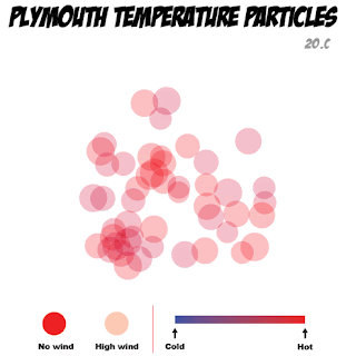
There are four main attributes which work together to finalise the visualisation. These are, the size of the circles, the position and area these circles take up on the stage, the colour of the circles, and finally the opacity of the circles. The first three are all to do with the temperature outside. Once the temperature is converted into a number Processing can use, it then determines which conditional statement is true, and applies general settings to do with the outside temperature. There are five different possible outcomes, where the temperature between 0℃ and 20℃, is divided into 4℃ ranges, and this affects the colour of the circles, ranging from blue (coldest) to red (hottest), the size of the circles, small for cold, larger for hot, and the area in which they appear, a small grouping in the centre for coldest, and a spread across the whole stage for the hottest. These circles do not appear in set positions, within each conditional statement is built in randomisers which ensure the circles attributes stay within the conditions, but are based on the information from the arch-os and sketch setup, so that each set of fifty 'molecules' are different from the last and not just one of five animations being played.
The final condition of opacity is taken directly from the wind speed. The circles are more opaque the higher the windspeed, and the logic behind this is that even though the temperature maybe 20℃ outside, if you were to look at the circles and they were faint in appearance, there would be high wind outside which adds to the chill, and takes away from the overall temperature.
Even though this may seem overly complicated to explain, I think these attributes add to the final product, and is a much more interesting way of representing the same data rather than just having a blue circle for cold, and a red circle for hot. I wanted it to be based 'loosely' on the way molecules interact whilst heating and cooling, with the more energy (heat) they have the more they disperse. With the colouring and opacity there to add to, and reinforce some points.
The pictures below are from the sketch running and show Plymouth on a hot windy day, and on a cold day with no wind. As you can see I have also added a title, key, and some of the actual data into the sketch. This was for two reasons firstly, I feel it makes the piece look more professional, and secondly, as I have already mentioned I am very practical so I would want a key and title to understand, and show that these appearing circles have a purpose.

So after looking back at my original idea, I wanted to find a way I could still achieve that concept with the ability level and skill set I have. I still wanted to use the outside temperature and wind speed to visualise a molecule simulation representation, and still wanted the same governing rules for behaviour, the only difference would be to replace the actual swarm mechanic with something I could achieve myself.
The substitute I settled on was instead of having x amount of particles moving around the stage, I would have them appear, and disappear every couple of seconds so that it isn't just static, and does appear animated. This is achieved simply by adding a count to the draw function, and an if statement so when the count reaches 50 it resets, with a frame rate of 25, this is every 2 seconds. Combine this with the fact that I am doing a representation of molecules, with are basically circles, the simple mechanic both works and is easy to achieve. The rules which apply to the circles is where the simulation steps up a gear.
There are four main attributes which work together to finalise the visualisation. These are, the size of the circles, the position and area these circles take up on the stage, the colour of the circles, and finally the opacity of the circles. The first three are all to do with the temperature outside. Once the temperature is converted into a number Processing can use, it then determines which conditional statement is true, and applies general settings to do with the outside temperature. There are five different possible outcomes, where the temperature between 0℃ and 20℃, is divided into 4℃ ranges, and this affects the colour of the circles, ranging from blue (coldest) to red (hottest), the size of the circles, small for cold, larger for hot, and the area in which they appear, a small grouping in the centre for coldest, and a spread across the whole stage for the hottest. These circles do not appear in set positions, within each conditional statement is built in randomisers which ensure the circles attributes stay within the conditions, but are based on the information from the arch-os and sketch setup, so that each set of fifty 'molecules' are different from the last and not just one of five animations being played.
The final condition of opacity is taken directly from the wind speed. The circles are more opaque the higher the windspeed, and the logic behind this is that even though the temperature maybe 20℃ outside, if you were to look at the circles and they were faint in appearance, there would be high wind outside which adds to the chill, and takes away from the overall temperature.
Even though this may seem overly complicated to explain, I think these attributes add to the final product, and is a much more interesting way of representing the same data rather than just having a blue circle for cold, and a red circle for hot. I wanted it to be based 'loosely' on the way molecules interact whilst heating and cooling, with the more energy (heat) they have the more they disperse. With the colouring and opacity there to add to, and reinforce some points.
The pictures below are from the sketch running and show Plymouth on a hot windy day, and on a cold day with no wind. As you can see I have also added a title, key, and some of the actual data into the sketch. This was for two reasons firstly, I feel it makes the piece look more professional, and secondly, as I have already mentioned I am very practical so I would want a key and title to understand, and show that these appearing circles have a purpose.


Wednesday, April 14, 2010
Processing step two and a half
Searching through some more of the sketches I found this sketch to do with flies swarming, funnily called Flies by Elie Zananiri.
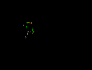
I think that if I were to change the flies to coloured particles, were the input is taken from the Arch-os data rather than the mouse input, then the swarming effect that these flies display would be perfect to hang my idea upon.

I think that if I were to change the flies to coloured particles, were the input is taken from the Arch-os data rather than the mouse input, then the swarming effect that these flies display would be perfect to hang my idea upon.
Tuesday, April 13, 2010
Processing step two
After looking at the data types again I have decided that I would like to take the outside temperature, and the three main inside temperatures, and represent those different data feeds in the style of molecules and particles. This would show how that when the temperature rises, the particles become more energised and mobile, therefore move all over the window in a swarm like fashion, as opposed to when they are colder, where they would have less energy so wouldn't move as much and stay together.
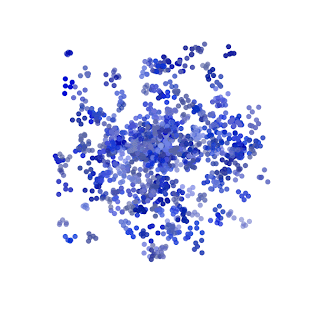
To get an idea of previous examples I visited a site http://www.openprocessing.org/ where there is a large collection of processing sketches. By searching for swarms and particles under their tag system I found a couple of really good, but really out of my league, sketches which show what processing is capable of. First is a sketch called Gravity swarm by Claudio Gonzales. http://openprocessing.org/visuals/?visualID=2363

Secondly is another good example of swarming behaviour called Molecule soup by Stingingeyes. http://www.openprocessing.org/visuals/?visualID=8675
To get an idea of previous examples I visited a site http://www.openprocessing.org/ where there is a large collection of processing sketches. By searching for swarms and particles under their tag system I found a couple of really good, but really out of my league, sketches which show what processing is capable of. First is a sketch called Gravity swarm by Claudio Gonzales. http://openprocessing.org/visuals/?visualID=2363

Secondly is another good example of swarming behaviour called Molecule soup by Stingingeyes. http://www.openprocessing.org/visuals/?visualID=8675

Processing step one
Our project brief was to take the RSS feeds from the Arch-OS system, then using Processing, take some of that environmental data and visualise this in an aesthetic way. The result must also be animated in some way, but have no interactivity.
There are two feeds, a live feed for the data at http://arch-os.scce.plymouth.ac.uk/bms_data.rss and also an archive of past data at http://x2.i-dat.org/archos/archive.rss
The first action I took was to enter the addresses into a browser to see what data types were available. There was basically data which fell into four groups, one for outside of the building, which included geographical data like wind speed and direction, rain fall, and temperatures etc. The other groups were effectively one for each of the three parts of the building, which contained data do to with the interior of the building, i.e. CO2 levels, elec use, and temperature.
I decided that the processing sketch could represent one of two things, literal data, or an abstract realisation of that data. My problem lay with the fact that I am a very literal person, and if asked to use data, I will show data. However this would not be very aesthetic, nor would it fill the brief, so I intend to produce something which fills both camps. To achieve this I propose to do a visual representation of something like a scion experiment or diagram, this will mean it is not just a set of figures, but people will also be able to relate to it. I also would like to use the exterior data due to the fact that it is to be displayed outside, agin so people can relate, and I find the data available for the outside to be more interesting.
Sunday, April 11, 2010
TV bumper rethink
After finishing my animatic for the 30secs bumper about myself, I have decided to make a small change. I was quietly pleased with the outcome, and thought that the comic book styling worked well. However, if I were to use photographs from my past as planed, I believe that all the continuity of the styling would be lost, as I would be mixing both real life images with cartoon illustrations. So to hopefully improve the overall quality of the piece, I have made the decision to replace all pictures which included myself, or my wife, and use the Jay character I created, and a new character to represent my wife, instead. The Jay character has become, and will continue to be, a fundamental part in my own personal online branding and persona, therefore the final piece will also be able to become an exercise in self promotion, should the final quality be as high as expected.
Subscribe to:
Posts (Atom)