Wednesday, April 28, 2010

Brand J! from the beginning part 9

The final piece in my online presence puzzle was the fact that I wanted to host my own blog at my domain name. I no longer wanted my blog on a different random address, so people wouldn't have to look in two different places to gain access to my full body of work. I wanted it to be in the same place as everything else, so to achieve this I tried using the download from wordpress.org but had trouble to install it as my hosting doesn't support one click install. After thinking logically about the problem I decided that I could either change the styling of my blogger blog, or I could try looking for another blog host.

Eventually I discovered that my hosting one.com allowed for a blog to be set up through them, this meant that not only would I be hosting it at my domain name, but I would have complete control over it in terms of styling as well. This also meant that I could link it into the design of my website structure, which I have done. The only problem whilst setting it up was that it did not allow for the old blog to be imported, so each of the 88 posts had to be copied across one at a time.

Below is a picture of the final blog, which completes the start up of brand J! on the web, well for the time being.

Brand J! from the beginning part 8

My portfolio page caused me the most headaches. I didn't want each item to link to another page, and I didn't want a larger block of items, which were pretty much the only two things I knew how to do. I wanted a lightbox effect, but in my style, so after many hours researching and trial and error I finally produced a working model I was happy with. However when I then tried this page in other browsers it just didn't seem to want to play, some of it down to slight mistakes I had made, but most of it down to unknown forces working against me in the galaxy. After some more fiddling though I managed to land with a version I was happy with, and which worked across all major browser types. I say all but still it doesn't fully work with IE6 due to a width:100% function in the css, but to change it for that would be plain wrong, so as a compromise I have included an if statement in the html which picks out if the user is using IE6, then warns them about these issues, as you can see in the lower screen shot below.


Brand J! from the beginning part 7

This is just a post to deal with my about page and my contact page. Both were fairly straight forward, again lots of meta data, description tags, and hidden text to help with SEO and accessibility, but on the whole I had the same header and footer across the whole site, and I wanted them both to have a comic/graphic feel that seemed professional. The biggest step here was to use a small php code so that the form was sent to my email address, making the contact form work properly as intended.


Brand J! from the beginning part 6

Now I move on to the biggest hurdle, which was designing my website to match my ideas, and more importantly making it work.

I wanted to follow convention in terms of in needed a home page, a portfolio page, an about page, and a contact form, along with my blog which I wanted to host myself at my domain name, not on another site, with a random address, like my blog at the time was.

I started with my home page which I decided early on I wanted to be something fun, I thought you go to the home page of the site, then link through to various other pages, you don't actually stop on this home hub. So I came up with the idea of Jay simply thinking, with his thoughts being the links to the other pages. Once you selected a page there was no need to return to the home page, you simply navigated around the rest of the site using the header and footer bars. It is just some fun on the front end of the site to demonstrate my ideas and skills, there is also my latest twitter feed with a link if you wanted to follow me. However to help with SEO and accessibility there is a lot of meta data and descriptions within the html to stop it just being a few pictures on a page.

Below are two screens showing the page. You can see my favicon in the address bar to help with brand recognition, and also you see in the second screen that when you hover over the link, Jay changes and has a 'eureka' pose, and the lightbulb lights up. The colour the bulb goes are all different and are carried across the theme of the site.

Brand J! from the beginning part 5

I wanted to get these two designs out onto the web whilst I was working on my new website design, as I didn't know how long it would take as I needed to get my skill level up to match my idea level, so I decided to alter my other outlets first.

I started with twitter as I was new to the site and believed it to be beneficial to change the design once rather than twice, also by having these things in place from the start and sticking with them it would help my followers become familiar with these designs, and therefore start a brand recognition. Twitter was also good as it allowed me to change the background to include my Jay character, and also my avatar to my new avatar, meaning both things were out there in the same place.

YouTube was next and was very similar, I altered my channel to match my twitter page in appearance, then finally I alter my flickr channel but was only able to change my avatar to the new version. I tried also to link back through these three sites as much as possible, and also linked back to my then unchanged site at every opportunity, with the promise of an updated site soon. I believe the old site stayed up for about 8 weeks from this point, however my designs and web address was out there, gaining brand awareness.

Below are some screens from my YouTube, flickr, and twitter pages showing my designs. Also there is a screen from my blog at the time showing the small changes I had made to it to include my avatar, and old website theme of blacks and reds.


Brand J! from the beginning part 4

With the basic designs done I set about making them a reality using Illustrator. I was pleased with the results and decided that if I could achieve that, then I could base an online presence around these two key images, and more importantly realise the potential I had in my ideas.

Below is the final design for my avatar, the design ideals have remained from the early ideas, so don't need explaining, but it's just better. It appears more professional aesthetically, and represents me as a person better with bright colours and the comic book style font. Also below is the final design for the Jay character, and a composition of the same character in various poses. He was designed to be quite simple in his makeup so that small changes in key parts would greatly change the appearance (this is what I have tried to demonstrate in the composition), I used bold lines and shapes, and this mixed with the font that accompanies him, gives the piece a real art deco feel. I tried to give him some of my physical characteristics, to make him a true online persona for me, like thaw quiff in the hair, the larger bottom lip, and the short stature. The main attribute of 'Jay' however is that he is always in grey scale. This is down to a number of reasons, firstly I love grey scale, and this is evident in my previous website design, secondly I feel it actually makes the design stand out more as it is unique, and lastly I think it makes the piece seem more professional overall.


Brand J! from the beginning part 3

However I looked at what I had done to that point, and the changes I made, and I realised that it wasn't my imagination which was letting me down, because I had some great ideas, and I asked myself, "Did I really come here, give up a good job, put my family in a worse position, to do a half hearted job?"

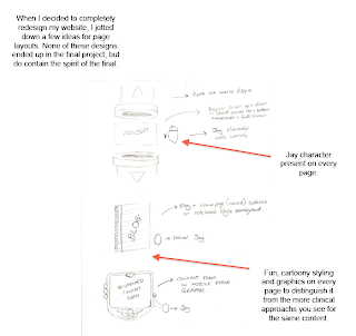
The answer to that was obviously no, I am trying to improve myself so my family has a better future. It became clear I was trying to play it safe, I knew I could do the basics because I had been taught the basics, and I thought if I carried on I would scrape by, but in the real world scraping by won't get you very far. Therefore I sat down with something I knew I could operate, a pencil and paper, and thought really hard about what and how I would like to present my work if the physical task of actually making it wasn't an obstacle. I knew I wanted an avatar to be an online signature, like a small stamp to say this is me, and that was what I had been working on, with the designs, before I decided to change everything. It also had to be centred around the characters 'J!' as that is what I had been using for years to end sms or the occasional email I did send, so it seemed right to carry that on. I didn't want it just for the sake of having it though, it had to mean something and be different. Also I knew I wanted a character, again something unique, which I could use instead of pictures of me, and also use as an online persona. So I started sketching.

Below are some of the sketches along with early website ideas to compliment the designs for the avatar and character.