Wednesday, April 28, 2010

Brand J! from the beginning part 9

The final piece in my online presence puzzle was the fact that I wanted to host my own blog at my domain name. I no longer wanted my blog on a different random address, so people wouldn't have to look in two different places to gain access to my full body of work. I wanted it to be in the same place as everything else, so to achieve this I tried using the download from wordpress.org but had trouble to install it as my hosting doesn't support one click install. After thinking logically about the problem I decided that I could either change the styling of my blogger blog, or I could try looking for another blog host.

Eventually I discovered that my hosting one.com allowed for a blog to be set up through them, this meant that not only would I be hosting it at my domain name, but I would have complete control over it in terms of styling as well. This also meant that I could link it into the design of my website structure, which I have done. The only problem whilst setting it up was that it did not allow for the old blog to be imported, so each of the 88 posts had to be copied across one at a time.

Below is a picture of the final blog, which completes the start up of brand J! on the web, well for the time being.

Brand J! from the beginning part 8

My portfolio page caused me the most headaches. I didn't want each item to link to another page, and I didn't want a larger block of items, which were pretty much the only two things I knew how to do. I wanted a lightbox effect, but in my style, so after many hours researching and trial and error I finally produced a working model I was happy with. However when I then tried this page in other browsers it just didn't seem to want to play, some of it down to slight mistakes I had made, but most of it down to unknown forces working against me in the galaxy. After some more fiddling though I managed to land with a version I was happy with, and which worked across all major browser types. I say all but still it doesn't fully work with IE6 due to a width:100% function in the css, but to change it for that would be plain wrong, so as a compromise I have included an if statement in the html which picks out if the user is using IE6, then warns them about these issues, as you can see in the lower screen shot below.


Brand J! from the beginning part 7

This is just a post to deal with my about page and my contact page. Both were fairly straight forward, again lots of meta data, description tags, and hidden text to help with SEO and accessibility, but on the whole I had the same header and footer across the whole site, and I wanted them both to have a comic/graphic feel that seemed professional. The biggest step here was to use a small php code so that the form was sent to my email address, making the contact form work properly as intended.


Brand J! from the beginning part 6

Now I move on to the biggest hurdle, which was designing my website to match my ideas, and more importantly making it work.

I wanted to follow convention in terms of in needed a home page, a portfolio page, an about page, and a contact form, along with my blog which I wanted to host myself at my domain name, not on another site, with a random address, like my blog at the time was.

I started with my home page which I decided early on I wanted to be something fun, I thought you go to the home page of the site, then link through to various other pages, you don't actually stop on this home hub. So I came up with the idea of Jay simply thinking, with his thoughts being the links to the other pages. Once you selected a page there was no need to return to the home page, you simply navigated around the rest of the site using the header and footer bars. It is just some fun on the front end of the site to demonstrate my ideas and skills, there is also my latest twitter feed with a link if you wanted to follow me. However to help with SEO and accessibility there is a lot of meta data and descriptions within the html to stop it just being a few pictures on a page.

Below are two screens showing the page. You can see my favicon in the address bar to help with brand recognition, and also you see in the second screen that when you hover over the link, Jay changes and has a 'eureka' pose, and the lightbulb lights up. The colour the bulb goes are all different and are carried across the theme of the site.

Brand J! from the beginning part 5

I wanted to get these two designs out onto the web whilst I was working on my new website design, as I didn't know how long it would take as I needed to get my skill level up to match my idea level, so I decided to alter my other outlets first.

I started with twitter as I was new to the site and believed it to be beneficial to change the design once rather than twice, also by having these things in place from the start and sticking with them it would help my followers become familiar with these designs, and therefore start a brand recognition. Twitter was also good as it allowed me to change the background to include my Jay character, and also my avatar to my new avatar, meaning both things were out there in the same place.

YouTube was next and was very similar, I altered my channel to match my twitter page in appearance, then finally I alter my flickr channel but was only able to change my avatar to the new version. I tried also to link back through these three sites as much as possible, and also linked back to my then unchanged site at every opportunity, with the promise of an updated site soon. I believe the old site stayed up for about 8 weeks from this point, however my designs and web address was out there, gaining brand awareness.

Below are some screens from my YouTube, flickr, and twitter pages showing my designs. Also there is a screen from my blog at the time showing the small changes I had made to it to include my avatar, and old website theme of blacks and reds.


Brand J! from the beginning part 4

With the basic designs done I set about making them a reality using Illustrator. I was pleased with the results and decided that if I could achieve that, then I could base an online presence around these two key images, and more importantly realise the potential I had in my ideas.

Below is the final design for my avatar, the design ideals have remained from the early ideas, so don't need explaining, but it's just better. It appears more professional aesthetically, and represents me as a person better with bright colours and the comic book style font. Also below is the final design for the Jay character, and a composition of the same character in various poses. He was designed to be quite simple in his makeup so that small changes in key parts would greatly change the appearance (this is what I have tried to demonstrate in the composition), I used bold lines and shapes, and this mixed with the font that accompanies him, gives the piece a real art deco feel. I tried to give him some of my physical characteristics, to make him a true online persona for me, like thaw quiff in the hair, the larger bottom lip, and the short stature. The main attribute of 'Jay' however is that he is always in grey scale. This is down to a number of reasons, firstly I love grey scale, and this is evident in my previous website design, secondly I feel it actually makes the design stand out more as it is unique, and lastly I think it makes the piece seem more professional overall.


Brand J! from the beginning part 3

However I looked at what I had done to that point, and the changes I made, and I realised that it wasn't my imagination which was letting me down, because I had some great ideas, and I asked myself, "Did I really come here, give up a good job, put my family in a worse position, to do a half hearted job?"

The answer to that was obviously no, I am trying to improve myself so my family has a better future. It became clear I was trying to play it safe, I knew I could do the basics because I had been taught the basics, and I thought if I carried on I would scrape by, but in the real world scraping by won't get you very far. Therefore I sat down with something I knew I could operate, a pencil and paper, and thought really hard about what and how I would like to present my work if the physical task of actually making it wasn't an obstacle. I knew I wanted an avatar to be an online signature, like a small stamp to say this is me, and that was what I had been working on, with the designs, before I decided to change everything. It also had to be centred around the characters 'J!' as that is what I had been using for years to end sms or the occasional email I did send, so it seemed right to carry that on. I didn't want it just for the sake of having it though, it had to mean something and be different. Also I knew I wanted a character, again something unique, which I could use instead of pictures of me, and also use as an online persona. So I started sketching.

Below are some of the sketches along with early website ideas to compliment the designs for the avatar and character.


Brand J! from the beginning part 2

At that point six months ago, I thought I was the king of the internet, well to the level at which my ability allowed me to be king, and I was happy with what I had achieved. I had put all my effort into what I had created to that point, so when we were then tasked with improving our online presence and outlets to a more professional standard, it felt like my world had been pulled out from under me.

I was already worried that I was too old, with no experience at all in this field, to try and take on this area of multimedia, so my first reaction was to say, "ok this is my level, lets change what I've got slightly, and say I've done the task"

From that attitude I came up with these design ideas and changes. They fitted in with my theme at the time, so my brand was coherent, I had joined some other networking sites like twitter and YouTube, so I was spreading my brand also.


Brand J! from the beginning

Nine months ago I shared an email address with my partner. That is it. That was all the online involvement I personally had. Don't get me wrong I would use the internet regularly to check out my favourite sites that I have mentioned in previous posts, and I love all technology, but as far as publishing and adding to the internet, I never did anything.

I have already stated that I wasn't interested in things like facebook or twitter, as any friend that I wanted to talk to, I would simply meet up with. I also think that I felt I had nothing to offer, there were people out there doing things bigger and better than I ever could, so why bother. Well I was naive and this year on this course has helped me see the light.

The reason for this tale was to highlight the point that only six months ago I got myself a facebook account and created a simple (rubbish) website, and that is how far I have traveled in these short months.

Below are some screen grabs from my first web site.


Monday, April 26, 2010

My TV Bumper V2.0

This is my second attempt at my final bumper. Not much is different from version one, just the opening few seconds.

Rather than having the normal sized front cover to the comic, with the white borders around the edges, this over-sized version keeps the audience within the scene, rather than following the white spaces, which in turn increases the suspension of disbelieve. This is only a small change bur one which hopefully adds to the piece significantly.

Sunday, April 18, 2010

The final thoughts

Overall I would say the project was a success. I say this because we didn't fail anything we set out to do, and the idea worked. However if I could change two things, then I would say that I would have liked to have nailed down a final idea as a group slightly earlier than we did, and linked to that point I would have loved to have been able to have taken this project down to Union Street and test it on location. I think that if we had been able to do these things then we could have seen where our idea would have affected people in the way we hoped, then whether it did or it didn't we could have adapted the project further to suit the location and brief. However there is always a point where you have let go and say it is finished, and I believe we did that at the correct time when we had an idea then realised it effectively.

I have to say that I have learnt a lot in this first year through this module, and I also believe that as I keep saying it has helped me to think outside of the box and see that you don't need the world to achieve your goals. As a group I feel we worked well, but as with any group some people excelled were as some people preferred to follow. If I were to start the project over now, I believe that the core ideas would stay the same but I would be more ambitious perhaps, because I have a skill set where 6 months ago I had none in this area.

Below are just a few pics from the final test.


Testing project

We tested the projection using the same set up as we would on location, the only differences are that we are obviously not on location, and the light source has come from a strip light and not a traffic light. The project works in the way we planned, and outlined in the previous posts. These movies show our project working from start to finish, Ben is holding the light sensor to the light source, Luke is filming the action, and I am at the controls of the computer this is all running through. The first video below is the groups 'official' final film, which as previously mentioned was filmed and edited by Luke Mears, the second video is a video I took of the first test run. Both clearly show the light sensor triggering the mic sensor linked to the arduino board, which in turn triggers the animation of RSS feeds.


How I hacked the toy

Whilst I was changing the remote from a push button to a light sensor, I decided it would be better to document it on video, rather than writing a boring list of instructions. I feel this should be included as it was a large part of our project, and I worked hard on getting it working. It isn't the best quality video, and may not even be the best quality hack, but I found it both fun and interesting, I owe a great deal of thanks to our lectures for opening my eyes to a way of thinking that had never even occurred to me before. Anyway here is the video which I have posted on YouTube. I hope you enjoy watching it as much as I did making it. J!

The final, final, final project design

Due to some unknown blip in the space time continuum, I am entering this post now, as I believed I had already done so about a month ago. Anyway after the meeting we had as a group to establish what we were going to finally settle on, as a practical doable project idea, we all went away individually and came up with suggestions which we could bring to the table. My idea is stated in a previous post.

When we sat down as a group again certain elements, which had been present all the way through, were obviously set in stone and would not be altered. The main points were that our project was going to be projection based, it was to be based at the 'Old Theatre' location on Union Street, Plymouth, and finally it had to show the bright past of the building along with its modern tragic state. Therefore with that in mind, and everyone's ideas considered, the final project idea took shape.

Using the electronic sound machine, and modifying it so that it is activated through a light sensor, rather than a button press, the remote unit would be placed against the red traffic light nearest to the projection location. When the light turned red, it will activate the remote through the light sensor, and send a signal to the sound unit. This unit will be placed within a sealed unit (i.e. plastic Tupperware box), along with the microphone which is attached to an arduino board, to prevent or limit outside noise accidentally setting off the microphone sensor. When the microphone attached to the arduino board registers a sound, it sends a high reading (1) to the serial port. Along with the arduino, Processing will also be running, and when, and whilst, Processing registers this high reading (1) on the serial port, it will activate the projection.

The projection will consist of thought provoking, controversial, messages and text which will be made up partly by RSS feeds taken from thisisplymouth.co.uk, which show the very dodgy recent past of the building as the 'Dance Academy', it will also start and end with the famous red curtains of the theatre to represent it's great history as a theatre. The projection will last slightly longer than the light change so that people do not become bored before it ends, but also they stay long enough to miss the light change and provoke a reaction from what is happening and what they see.

Below are a couple of images which were produced by group member Luke Mears, the first is a visualisation of what it could look like at the location, and the other two are images of the unfinished RSS reader which he is working on.


Final bumper V1.0

Again just a short post and link to my final 30sec bumper about myself. It follows all the ideas laid out in the animatic, which can be found, with a description, earlier on my blog. I am very pleased with the outcome, especially as it was my first true use of AfterEffects, and was also completed ahead of schedule so that if anyone out there over the next few weeks does have any suggestions for improvements, I will be able to improve it.

Anyway I hope you enjoy it as much as I enjoyed making it. It can be found on YouTube, or slightly better quality on my website. Cheers J!

Processing final

Only a small post with the link to my final Processing piece which is running on my site.

www.jmmoore.co.uk/processing.html


I hope you enjoy it. J!

Sketch signing

Applets by comparison are considered untrusted since they are initiated automatically in the browser. This restriction prevents applets from doing certain things, such as loading content from a different domain than the one hosting the applet.

Due to the fact that I am using data from another domain, and that this piece will have to run from my website, I will obviously have to sign the applet. To do this I had to use 'Terminal' on the mac, in the utilities folder which I rarely visit. I had never used this program before so after doing some research online I found these two helpful resources, which with a bit of common sense made this process easy to achieve.

First off was a YouTube video on the general workings of Terminal, then secondly this forum post on the actual process of signing the sketch.

I have also included this picture of my signing just to show where the changes are that I made to make it relevant to my piece.

Processing - Back to the drawing board (almost)

After spending a substantial amount of time trying to deconstruct and understand the 'Flies' sketch, I have come to the decision that I am no longer going to base my sketch around the swarm mechanic. This was due to two main reasons, firstly I feel I haven't spent enough time with 'Processing' to be able to understand how this works, even though I could bend the existing sketch to fit my purpose, and secondly, linked to this point is the fact that to make my sketch work in the way I intended it to I would have to 'borrow' too much of the pre-existing code, and therefore it wouldn't feel, or be my own work.

So after looking back at my original idea, I wanted to find a way I could still achieve that concept with the ability level and skill set I have. I still wanted to use the outside temperature and wind speed to visualise a molecule simulation representation, and still wanted the same governing rules for behaviour, the only difference would be to replace the actual swarm mechanic with something I could achieve myself.

The substitute I settled on was instead of having x amount of particles moving around the stage, I would have them appear, and disappear every couple of seconds so that it isn't just static, and does appear animated. This is achieved simply by adding a count to the draw function, and an if statement so when the count reaches 50 it resets, with a frame rate of 25, this is every 2 seconds. Combine this with the fact that I am doing a representation of molecules, with are basically circles, the simple mechanic both works and is easy to achieve. The rules which apply to the circles is where the simulation steps up a gear.

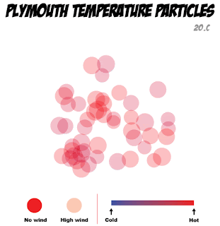
There are four main attributes which work together to finalise the visualisation. These are, the size of the circles, the position and area these circles take up on the stage, the colour of the circles, and finally the opacity of the circles. The first three are all to do with the temperature outside. Once the temperature is converted into a number Processing can use, it then determines which conditional statement is true, and applies general settings to do with the outside temperature. There are five different possible outcomes, where the temperature between 0℃ and 20℃, is divided into 4℃ ranges, and this affects the colour of the circles, ranging from blue (coldest) to red (hottest), the size of the circles, small for cold, larger for hot, and the area in which they appear, a small grouping in the centre for coldest, and a spread across the whole stage for the hottest. These circles do not appear in set positions, within each conditional statement is built in randomisers which ensure the circles attributes stay within the conditions, but are based on the information from the arch-os and sketch setup, so that each set of fifty 'molecules' are different from the last and not just one of five animations being played.

The final condition of opacity is taken directly from the wind speed. The circles are more opaque the higher the windspeed, and the logic behind this is that even though the temperature maybe 20℃ outside, if you were to look at the circles and they were faint in appearance, there would be high wind outside which adds to the chill, and takes away from the overall temperature.

Even though this may seem overly complicated to explain, I think these attributes add to the final product, and is a much more interesting way of representing the same data rather than just having a blue circle for cold, and a red circle for hot. I wanted it to be based 'loosely' on the way molecules interact whilst heating and cooling, with the more energy (heat) they have the more they disperse. With the colouring and opacity there to add to, and reinforce some points.

The pictures below are from the sketch running and show Plymouth on a hot windy day, and on a cold day with no wind. As you can see I have also added a title, key, and some of the actual data into the sketch. This was for two reasons firstly, I feel it makes the piece look more professional, and secondly, as I have already mentioned I am very practical so I would want a key and title to understand, and show that these appearing circles have a purpose.


Wednesday, April 14, 2010

Processing step two and a half

Searching through some more of the sketches I found this sketch to do with flies swarming, funnily called Flies by Elie Zananiri.


I think that if I were to change the flies to coloured particles, were the input is taken from the Arch-os data rather than the mouse input, then the swarming effect that these flies display would be perfect to hang my idea upon.

Tuesday, April 13, 2010

Processing step two

After looking at the data types again I have decided that I would like to take the outside temperature, and the three main inside temperatures, and represent those different data feeds in the style of molecules and particles. This would show how that when the temperature rises, the particles become more energised and mobile, therefore move all over the window in a swarm like fashion, as opposed to when they are colder, where they would have less energy so wouldn't move as much and stay together.

To get an idea of previous examples I visited a site http://www.openprocessing.org/ where there is a large collection of processing sketches. By searching for swarms and particles under their tag system I found a couple of really good, but really out of my league, sketches which show what processing is capable of. First is a sketch called Gravity swarm by Claudio Gonzales. http://openprocessing.org/visuals/?visualID=2363


Secondly is another good example of swarming behaviour called Molecule soup by Stingingeyes. http://www.openprocessing.org/visuals/?visualID=8675

Processing step one

Our project brief was to take the RSS feeds from the Arch-OS system, then using Processing, take some of that environmental data and visualise this in an aesthetic way. The result must also be animated in some way, but have no interactivity.
There are two feeds, a live feed for the data at http://arch-os.scce.plymouth.ac.uk/bms_data.rss and also an archive of past data at http://x2.i-dat.org/archos/archive.rss


The first action I took was to enter the addresses into a browser to see what data types were available. There was basically data which fell into four groups, one for outside of the building, which included geographical data like wind speed and direction, rain fall, and temperatures etc. The other groups were effectively one for each of the three parts of the building, which contained data do to with the interior of the building, i.e. CO2 levels, elec use, and temperature.


I decided that the processing sketch could represent one of two things, literal data, or an abstract realisation of that data. My problem lay with the fact that I am a very literal person, and if asked to use data, I will show data. However this would not be very aesthetic, nor would it fill the brief, so I intend to produce something which fills both camps. To achieve this I propose to do a visual representation of something like a scion experiment or diagram, this will mean it is not just a set of figures, but people will also be able to relate to it. I also would like to use the exterior data due to the fact that it is to be displayed outside, agin so people can relate, and I find the data available for the outside to be more interesting.

Sunday, April 11, 2010

TV bumper rethink

After finishing my animatic for the 30secs bumper about myself, I have decided to make a small change. I was quietly pleased with the outcome, and thought that the comic book styling worked well. However, if I were to use photographs from my past as planed, I believe that all the continuity of the styling would be lost, as I would be mixing both real life images with cartoon illustrations. So to hopefully improve the overall quality of the piece, I have made the decision to replace all pictures which included myself, or my wife, and use the Jay character I created, and a new character to represent my wife, instead. The Jay character has become, and will continue to be, a fundamental part in my own personal online branding and persona, therefore the final piece will also be able to become an exercise in self promotion, should the final quality be as high as expected.